
Ten buttons

I've been building Starquest's interface: the market, the contracts board, chat, ship fitting, the map, settings, and the flight HUD you actually fly with. Most of it went roughly the way I expected. The action bar did not. Ten squares at the bottom of the screen took more passes than all the windows put together.
Two things pull against each other here. A game like this has a lot to tell you: cargo and prices, hulls and slots, contracts, what's nearby and how far off it is. That wants dense screens you can sit and read. Flying wants the opposite, a few controls you can take in at a glance without looking away from the rock you're cutting. Both live in the same cockpit, and most of the work is making them agree.
A kit is not a screen
I built the parts first: buttons, fields, tabs, lists, tables, windows, tooltips, notifications, and one place that decides how credits and distances get written. There's a gallery in the dev build where you can poke all of it.
Looking at it, the honest reaction was that it felt basic. A gallery can't tell you much, because it has no opinion about what goes next to what. So I built six real windows instead: market, contracts, chat, fitting, map and the escape menu. Real code, working controls, mostly placeholder data. They were the review, and each one found something the kit couldn't say cleanly. The market wanted the best bid and ask in the list itself, so you can see what's worth opening before you open it. Fitting wanted stat changes as signed differences, because nobody remembers what the number was a second ago. Chat wanted to hold your place when a message arrives while you're reading back. Small things, and you only find them by building the actual screen.
The first visual pass had more of everything: bevels, plates, a box around every section. It looked like a space game, and it made every screen harder to read when there's already a lot to read. What I settled on is quieter. Thin rims, hairline separators instead of nested frames, dense rows, figures aligned so you can compare them by eye. Emphasis is expensive, so I spend it on selection, state and consequence.
The HUD
The flight HUD splits three ways. Left is what's being said to you: objectives, notifications and chat. Right is what's around you: radar and the target list. Bottom centre is what your ship can do and sustain, four bars for shield, armour, hull and capacitor with the action row under them. The middle is left alone so you can see and fly.
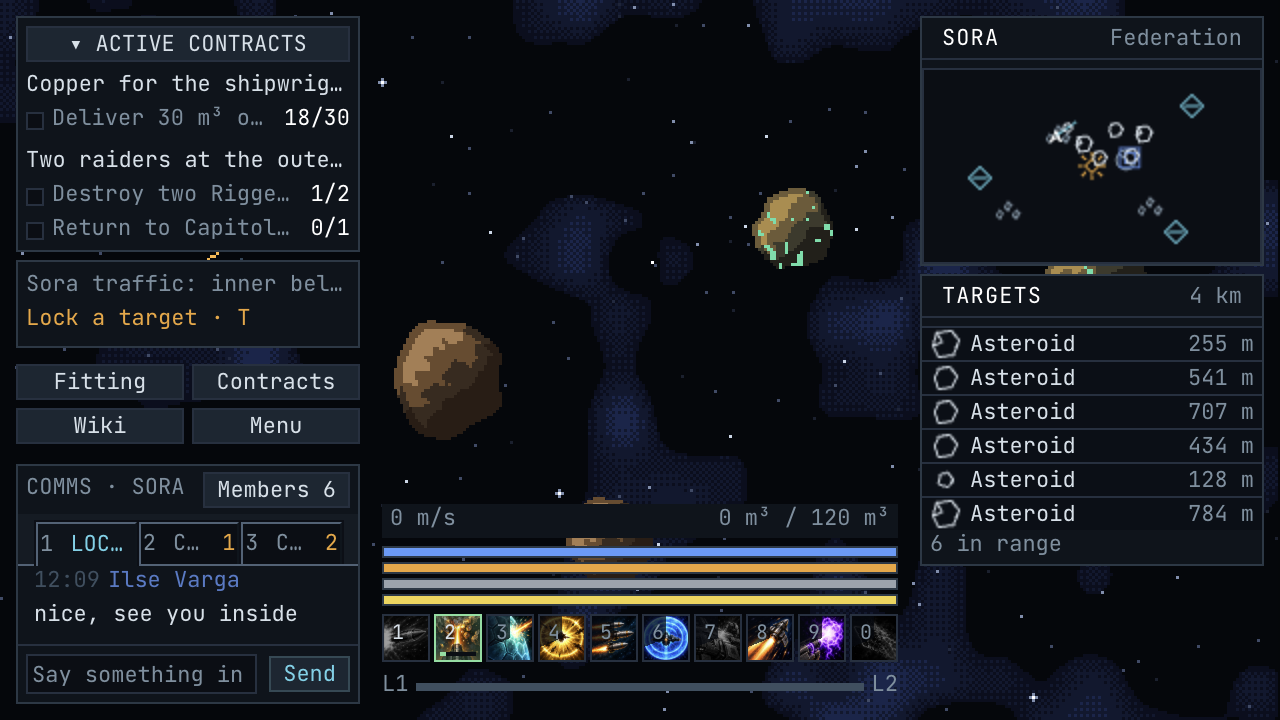
Targets are one line each, icon, name and distance, drawn from one set of symbols shared by the list, the radar and the maps, so a station looks like a station wherever you meet it. Notifications turned out to be a layout problem rather than a stack, so the left side gets a space budget and extra messages queue in order. One message is easy. Four of them, a growing objective list and someone playing at 200% scale is not.
Ten buttons
Action bars are everywhere, which makes them harder rather than easier. People already know roughly how one should behave, so anything slightly off gets read as a mistake rather than a decision. And a slot has to answer more questions than it looks like it should. Did the game hear me? Is it getting ready? Is it running? Is it recovering? Is the shared one second lockout still going? Or is it a toggle that's switched off? That's six answers, and early versions of mine had about two.
I went round this a lot. Out went a tick marking active slots, when the border and the picture already said so. Out went the little boxes behind the key numbers, which only put a box inside a box. The numbers stopped moving when you pressed them, because the feedback should come from the button and not the label jumping. And I stopped draining the colour out of every other ability while a shared timer ran, which had been making the whole row look broken once a second.
Switched off toggles went fully greyscale instead of nearly transparent, because off is a state and you should still recognise the picture. Instant abilities stopped flashing green before dropping into cooldown, since that implied a duration that doesn't exist. Accepted input got its own short pulse on mouse and keyboard alike, because clicking felt more real than pressing a number and that's the wrong way round.
Orange means getting ready
The one that took longest was telling preparation apart from activity. An ability spinning up looked exactly like one already working, because both were green, and that is precisely the thing you want to know in a fight.
Preparation is orange now. The border goes orange, an inner glow grows as it fills, and a strip inside the slot tracks the same progress as the bar above the row. When it completes the colour moves on: green if something is now running, straight to a cooldown sweep if it was instant.
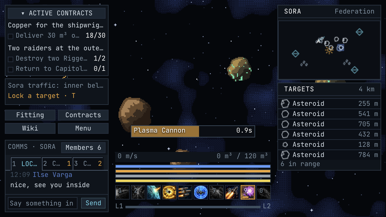
While it's preparing, the slot is also the cancel button. Press 9 again, or Escape, and it stops. Nothing fires and no cooldown starts, though whatever's left of the global cooldown stays where it was. Holding the key down doesn't start and cancel it forty times a second, which I found out the way you'd expect.
None of that works unless the data underneath is honest. One disabled flag and a timer can't answer "can I press this", so every action declares its own mode, its timings, its cooldown rules and its separate relationship to the shared lockout. Needing the global cooldown and starting one are different things, and keeping them apart means equipment can behave differently without anyone special-casing a button.
Learning without leaving the game
That's a lot of rules for something meant to feel obvious, so the game explains itself. Hover an ability for its timings, its state and what it does. Hold shift and the tooltip stays anchored, so you can move the pointer into it instead of chasing it across the screen. The underlined terms are links.
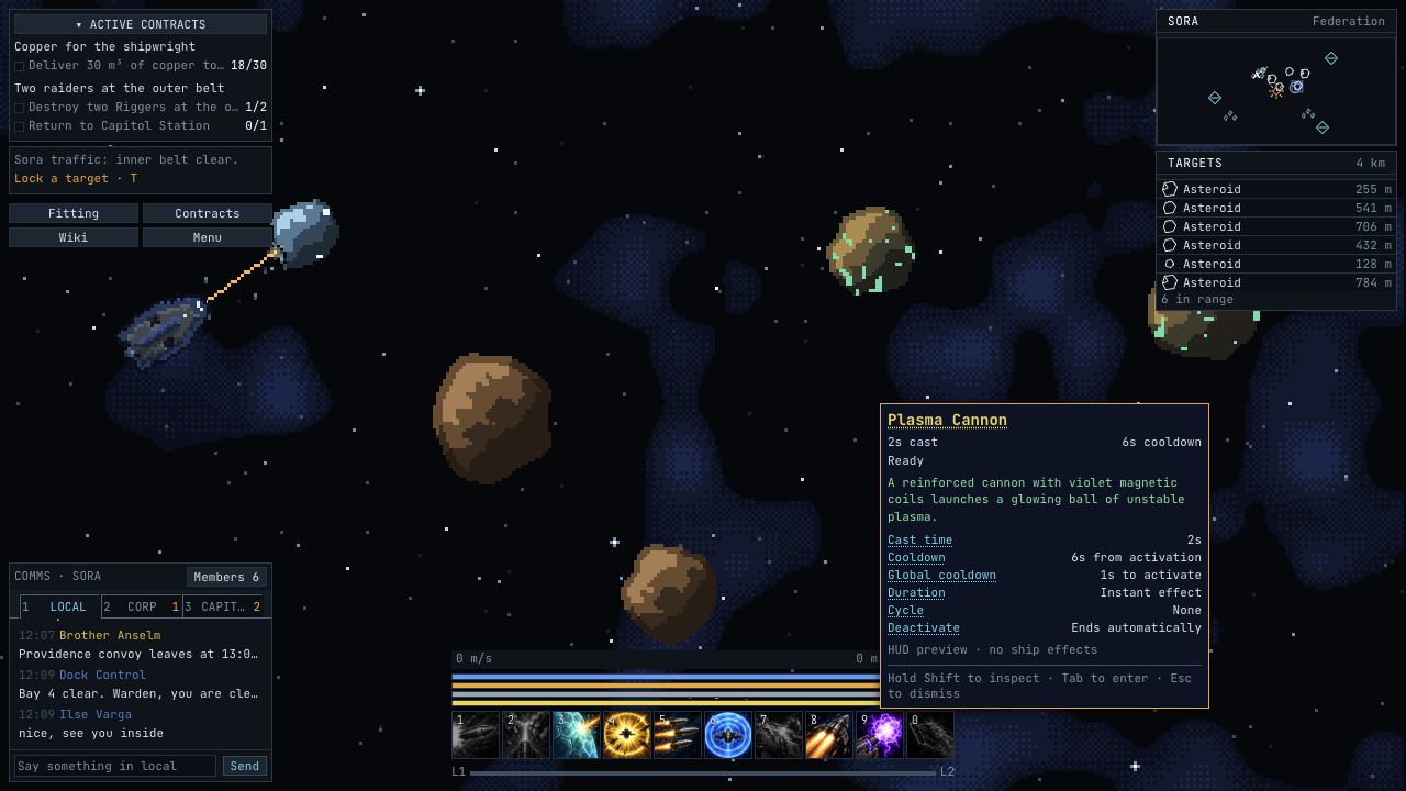
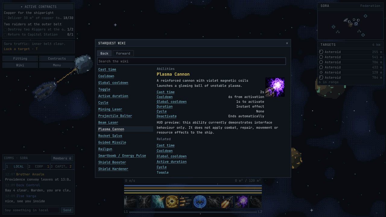
They open the game's own wiki, which has 38 articles, one for each ability and six for the mechanics behind them. It searches, it has back and forward, and its timing rows come from the same specs the action bar runs on, so the button, the tooltip and the article can't drift apart and tell you three different stories.
What this isn't yet
The action bar is a test bench. Its ten abilities demonstrate the states and none of them shoot anything, repair anything or move you anywhere, which every wiki page says in as many words. The timings exercise those states rather than balance anything. The market has an order book with no economy behind it, and the escape menu has save and load buttons that don't save or load. Fitting is the closest to real, reading the actual equipment catalogue.
What's finished is the layer underneath. You can tell what something is, what it's doing, and what pressing it will do. Wiring that to a ship that actually takes damage comes next.
It isn't perfect either. Text sits very slightly too high inside buttons and input fields and I haven't found the cause. The automated checks pass happily, because everything fits and everything works, and it took a person squinting at a screenshot to see it at all.
That's the state of it. The interface can say what's happening; the next job is making things actually happen. I'll write about that when there's something to shoot at.